Project #2: Dynamic Value Ranges: Sighting practices / Atmospheric Perspective


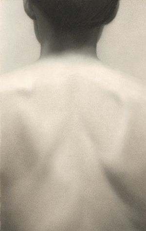
Drawing by Marina Fridman

We can depict what we see most effectively by simplifying our observations.
Simplifying values produces a much more cohesive, believable drawing than recording every value and minute detail that you see. Artists realized this hundreds of years ago and created a system of simplifying and organizing values called...

The Value Scale

Artists use a system of nine (or more) values ranging from white to black, called a value scale. The scale consists of four light values (values 1 to 4”), a middle value (also called a half-tone), and four dark values (values 6 to 9”). A value scale is essentially a simplified gradation.



Further Links:
https://www.thedrawingsource.com/value-drawing.html
Project #2 Dynamic Value Ranges

There is a difference between how we see values in our experience and how an artist or designer may wish to depict those values.  The lightest object in our world humans experience might be the sun -- way too bright to directly at.  On the opposite contrast to that would be complete lack of light, the interior of a cave, perhaps.  Such extremes are much farther apart than the range of values available to an artist or designer.  Sometimes an image may have numerous values within it, expressing a full range, others may show one tonal range or another. For instance, the overall tonality of the drawing is on the light end of the scale, known as high-keyed. Conversly, another drawing may take it's value from the dark end of the scale, which is called low-keyed.  

High keyed drawing : Still Life
i. Create a fictional still life drawing that contains two light value range objects sitting on a table top.  This is to be completed in graphite.

ii. Draw a "horizon" line across your paper

iii. Add one object by mapping it, placing a pencil dot of the top of the form and at the bottom of the form.

iv. Complete the representation of this object created by linear means. Remember the overall color of your object and the drawing inspired by it is to represent a High Keyed drawing!

v. Place a second object in the middle ground, thus this object will be smaller than your first.

vi.  Complete both subject matter items via contour edges

vii.  Consider the use of atmospheric perspective to illustrate the 'distance' between the two objects.  Thus, things further from your eye sight might appear out of focus, closer in value range and 'cooler.' Recall the imaginative story of the trip you will take to the Blue Ridge Mountains.  At a distance the mountain range appears in blue / violet / grey.  They are also out of focus.  Upon driving closer to the mountain range, they come into sharper focus, and enter into full chroma.  The distance between the range and the driver is a perfect example of atmospheric perspective at play.  This is also an excellent example of how a spatial field moves from optical (imaginative/fictious) color to local color (actual color). 


Popular posts from this blog

Project #1: DRAWING is...

What is Drawing? According to Webster's dictionary, drawing is defined as “the art or technique of representing an object or outlining a figure, plan, or sketch by means of lines." This, of course, is usually the first thing many people think of when it comes to drawing, I was and still am one of them.  Yet, after really contemplating the word drawing and looking through various definitions, I’ve come to find that it's meaning isn’t art specific, it engulfs a lot of different positions.  Drawing isn’t just about the line one puts on paper, it’s about what you take from that line.  Minimalist artist Sol LeWitt once said, “When words such as painting and sculpture are used, they connote a whole tradition, thus placing limitations on the artist who could be reluctant to make art that goes beyond the limitations."       I think the same thing goes for the word drawing , drawing has always been seen as this one method used in th...

Project #5 Negative Shape Drawings

In drawings there are three basic elements of composition:  the frame (the edge of the pictorial space)  the positive the negative space The positive space is easiest to understand because we see it. Generally, it is the space occupied by your subject.  Conversely, negative space is the space that is not your subject and people often simply forget about.  Simply put,  Negative space  is the  space  that surrounds an object within an image.  It is just as important as that object itself -- air is important for most every living organisms, isn't it? N egative space  helps to define the boundaries of  positive space  and brings balance to a composition. The negative space is defined by the edges of the positive space and the frame or border (the third element).  Thus, part of our negative space is bound by the frame and another part is bounded by the positive space.  S...

Contemporary Artist + Designer List

a global list of artists / designers for your reference with URL links ... Marina Abramovic  (born 1946), performance artist Vito Acconci  (born 1940), installation and performance artist Rita Ackermann  (born 1968), artist Chantal Akerman  (born 1950-2015), filmmaker Vikky Alexander  (born 1959), installation artist Edward Allington  (born 1951) sculptor Laurie Anderson  (born 1947), performance artist Carl Andre  (born 1935), sculptor Janine Antoni  (born 1964), sculptor and installation artist Ida Applebroog  (born 1929), painter Nobuyoshi Araki  (born 1940), photographer Siah Armajani  (born 1939), sculptor Mireille Astore  (born 1961), conceptual, performance and installation artist Javier Arevalo  (1936),Painter Francis Bacon  (1909–1992), painter Jo Baer  (born 1929), painter John Baldessari  (born 1931), conceptual artist Banksy  (born 1974), graffiti ar...